- UniD Documents
- UniDescription Tools: How do I use the basic functions and features of UniD?
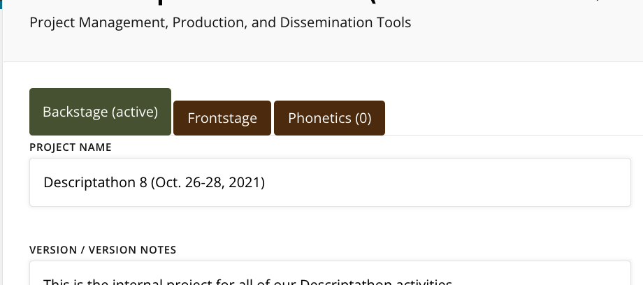
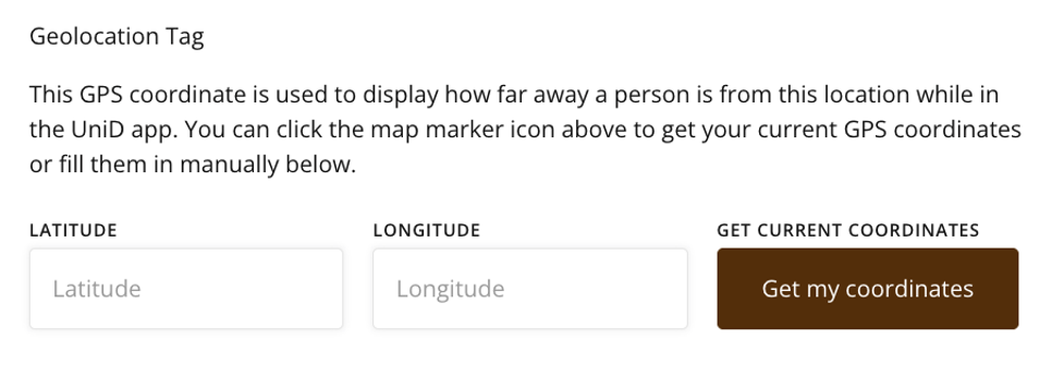
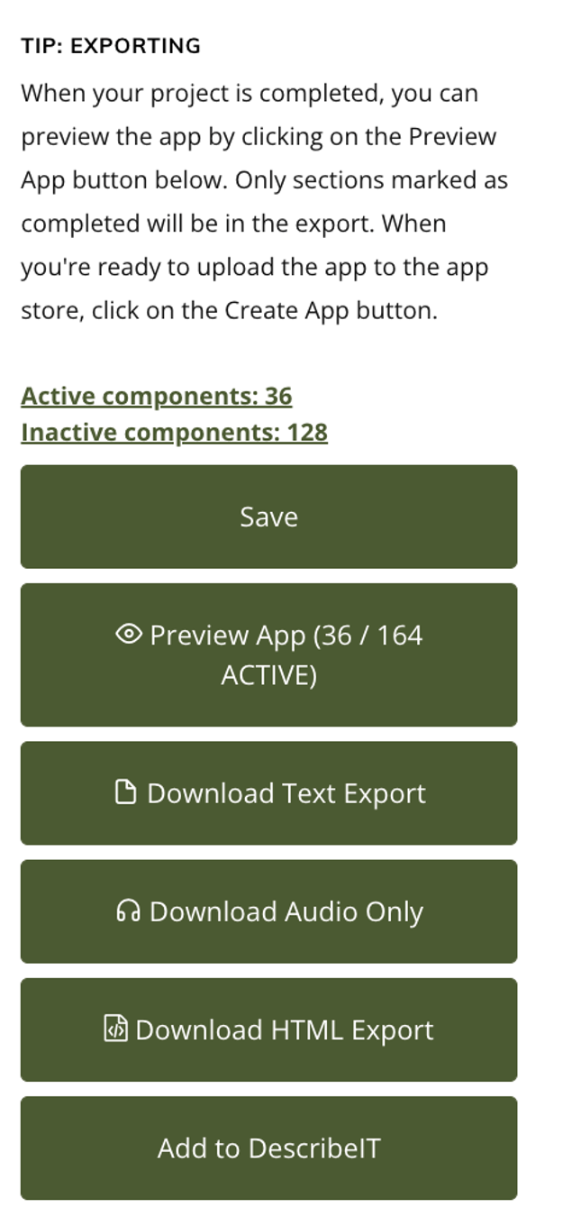
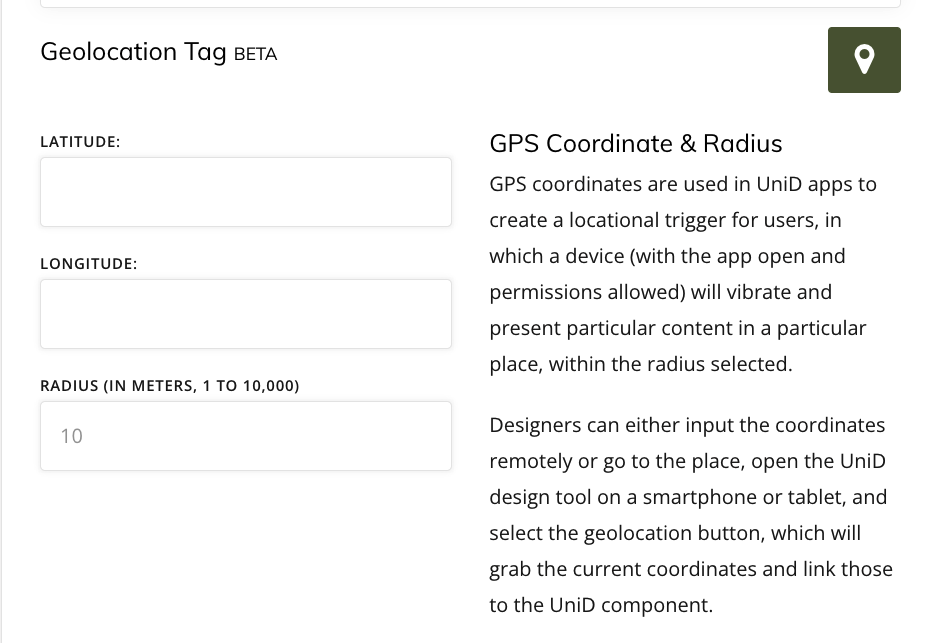
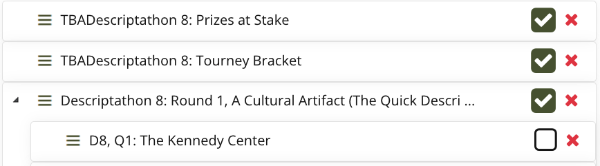
- UniDescription Tools: How do I use the Backstage on UniD?
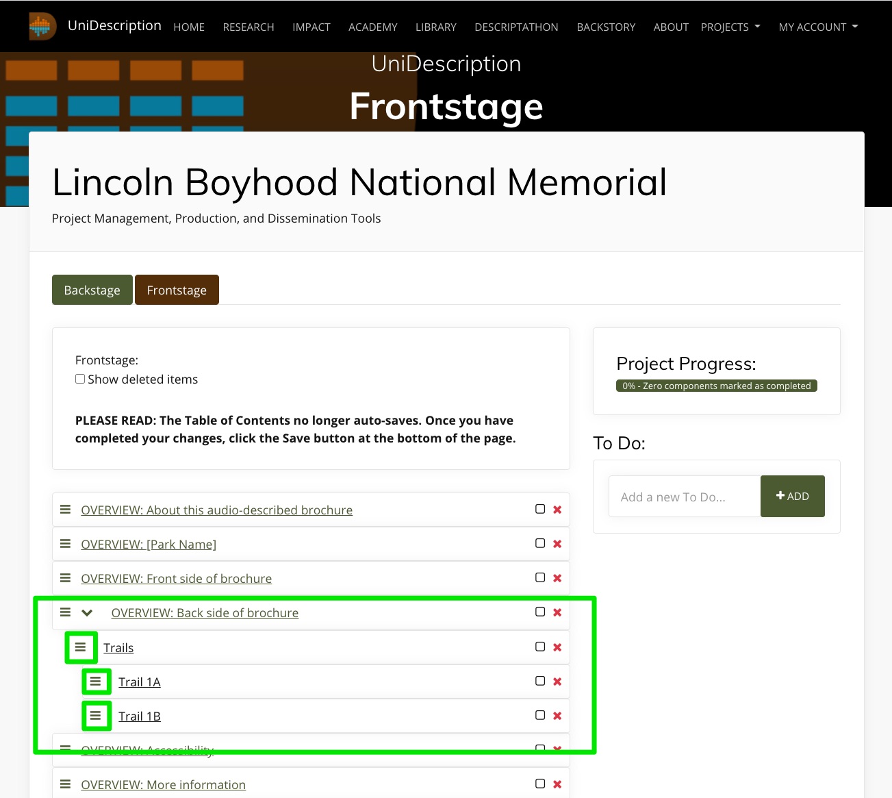
- UniDescription Tools: How do I use the Frontstage and Component views on UniD?
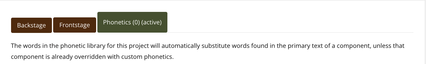
- UniDescription Tools: How do I use the Phonetic tool to improve the machine voice?
- UniDescription Tools: How do I describe or judge during a Descriptathon?
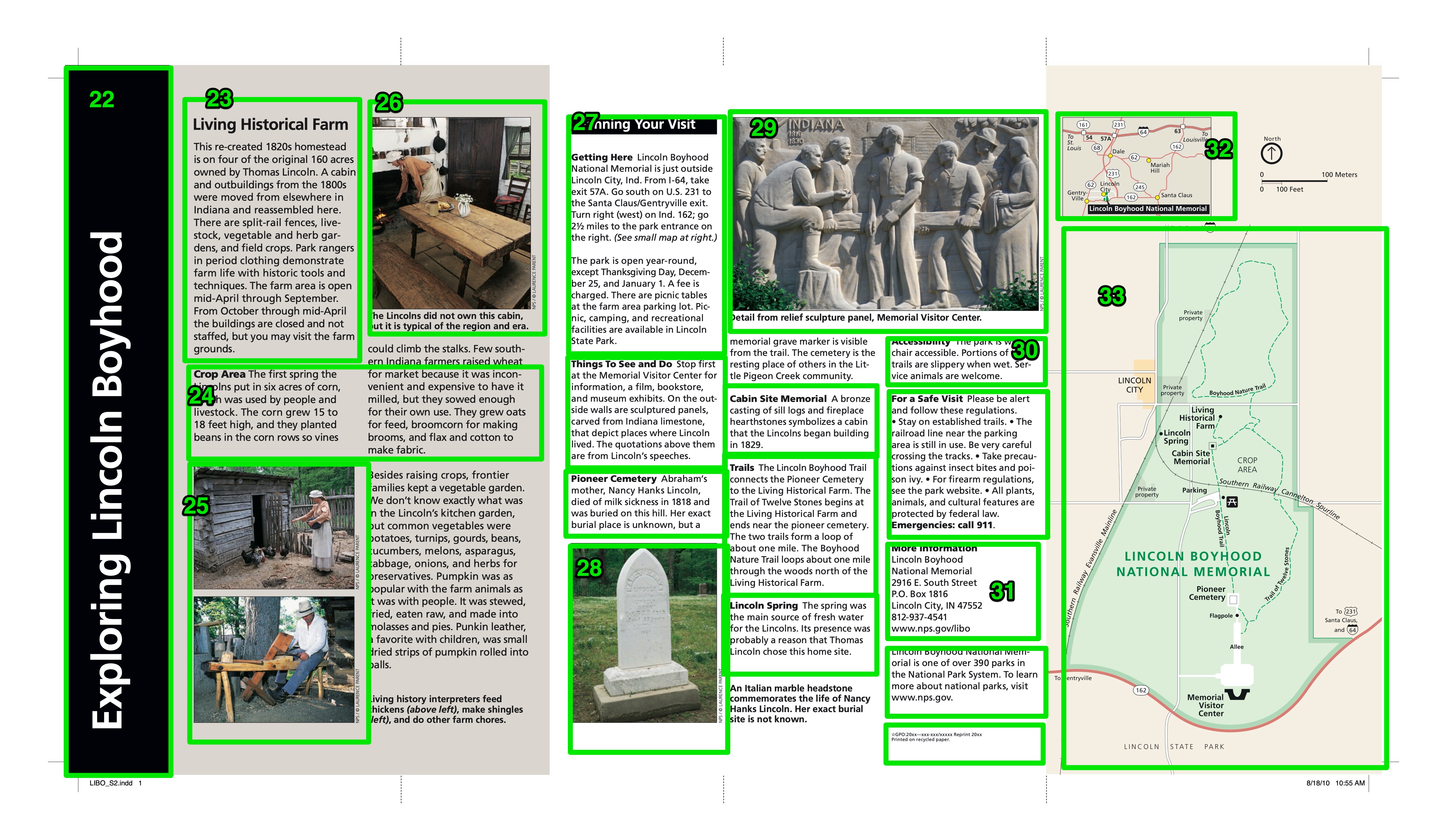
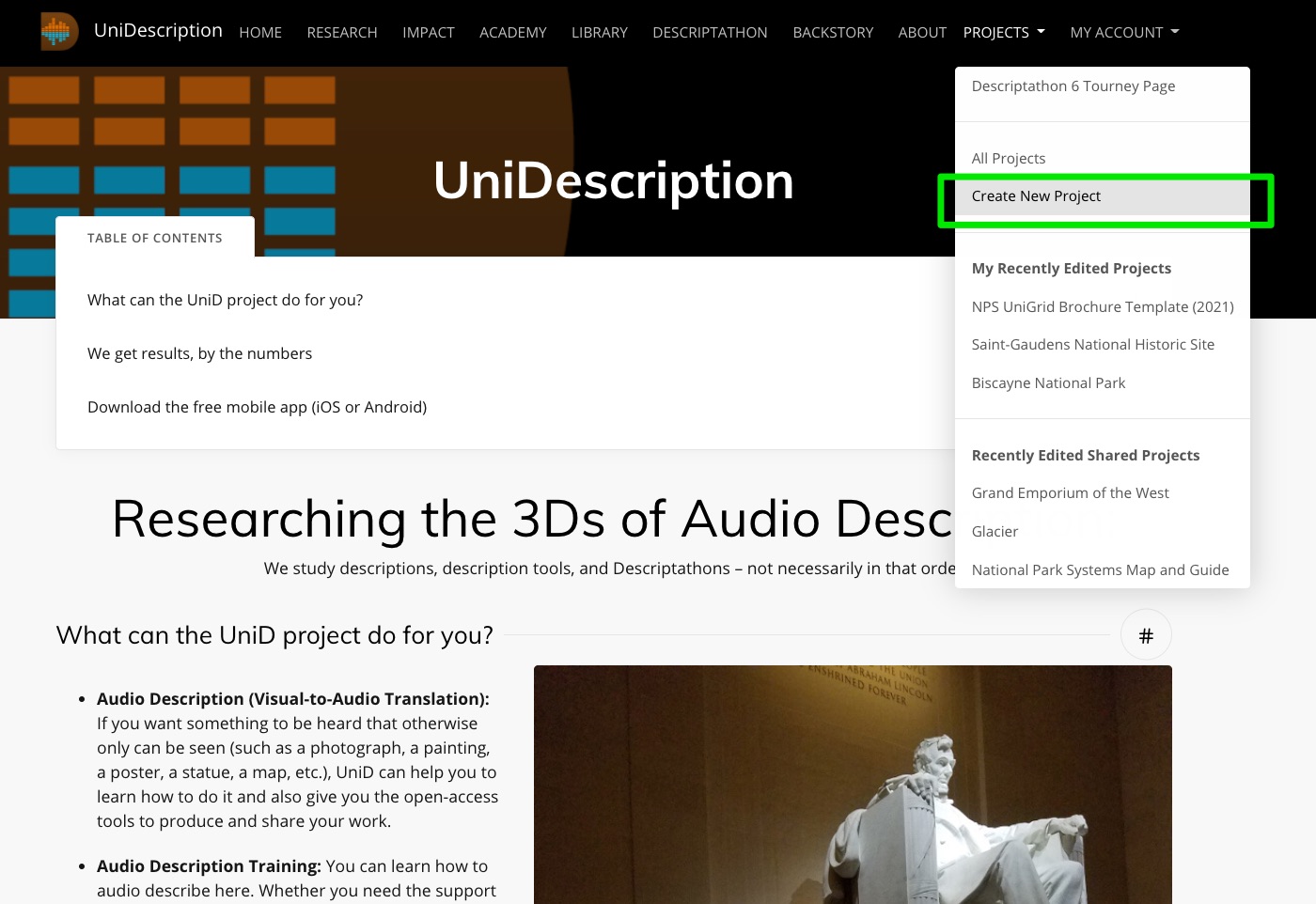
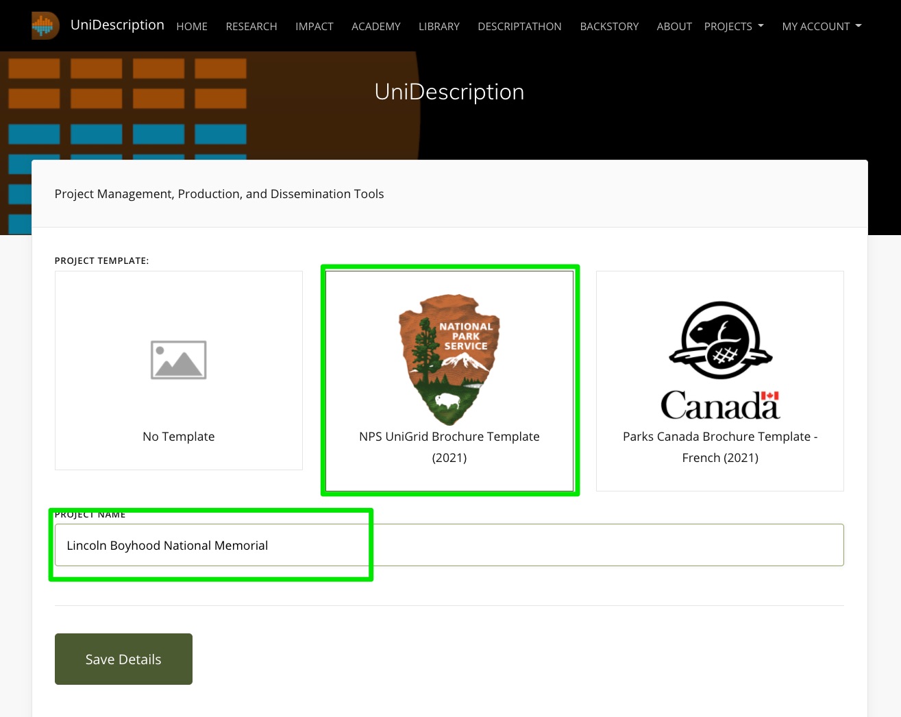
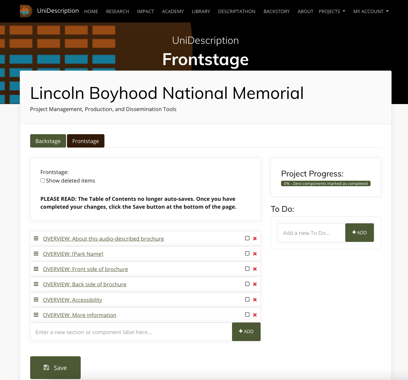
- Learn About Audio Description Production: How to Set Up a Brochure Project
- Learn About Audio Description Genres: Portraits (Describing People)
- Learn About Audio Description Genres: Describing Cultural Artifacts (or Objects)
- Learn About Audio Description Genres: Maps
- Learn About Audio Description Genres: Collages (Images Combined to Make Meaning)
- Key Terms: What are the specialized terms scholars use when we discuss Audio Description?
- Key Statistics: About blindness and visual impairment worldwide
- Theoretical Models of Disability: How do scholars conceptualize Audio Description?
- Research Questions: What are RQs in Audio Description we have (and haven't) addressed?
In 2014, The UniDescription Project was just an idea about how to make the world a more-accessible place through academic research. Now 10 years later, our UniD team has a long list of accolades and accomplishments to its credit, including creating the leading production software for descriptions of static media (such as photographs and maps) in the world. We have made that software Open Access and Open Source, so everyone can use it. And the descriptions always are free to hear.
We have collaborated with about 200 U.S. National Park Service sites and other public attractions over the past decade to make media more accessible for their visitors using Audio Description. And we have trained hundreds of employees at those places about AD and media accessibility in general. For those efforts, our work has been supported by grants from the NPS, the National Endowment for the Humanities, the National Endowment for the Arts, and Google, among others. And our team members have been recognized with national and international awards from the American Council of the Blind, Helen Keller Services, the American Alliance of Museums, and with the MUSE Research & Innovation Award. ...
With Covid-19 pandemic restrictions finally fading this year, UniD researchers were back into the field doing extensive studies at two nationalparks: Pearl Harbor National Memorial in Honolulu, HI,
and Pullman National Historical Park in Chicago, IL. We also completed another major Descriptathon workshop, our ninth, which was our largest to date, with more than 150 people participating from around the U.S., in Canada, and in the United Kingdom. They were a part of 16 teams in the friendly competition designed to improve accessibility worldwide.
We shared at academic conferences and through scholarly publishing much new empirical work, and, in a sign of the times, we also haveintegrated our first AI (Artificial Intelligence) tool in our UniD software, with two other related AI tools under development as well and planned for release before Descriptathon 10, scheduled for February 2024.
We welcomed many new partners to our initiative, too, including our first state park and several other organizations that independently used UniD tools. ...
uReview makes its debut, amplifying research
The UniDescription Project always has been a research-focused initiative, intent on bringing more empiricism to the field of Audio Description. But now — following years of development of this idea — we have a robust new online uReview tool that allows us to ask research questions about descriptions, even at scale, and handle that data in efficient ways. In other words, we now can conduct Audio Description research beyond what others in the world can do. That should make for an exciting future. We also had many other important achievements in this past academic year (2021-2022), including ...
More Partners, More-Accessible Public Places
The UniDescription Project has carried on, despite this pandemic-plagued period of world history. We worked remotely. We postponed field visits. We incorporated Zoom. We have kept trying to make the world more-accessible for people who are blind or have low-vision. This annual report shares some of these 2020-2021 highlights.
"With so much sad and scary discourse circulating, this month seemed an appropriate time to launch a counter-narrative in the form of our first public UniDescription Report. Positive news, like what is in this report, has been happening in 2020, too. And you are a part of it.
Our small research-and-development team – working from a tiny speck of an island in the middle of the Pacific Ocean
– has been collaborating for the past five+ years with people from around the United States to steadily improve media accessibility, especially for those who are deaf-blind, blind, or low-vision. We are sending out this report as a way to further connect with you (our partners), to share our collective successes together, and to update you about what we are planning. We have many exciting ideas in motion!
This week is Helen Keller Deaf-Blind Awareness Week, for example, and one of our Co-PIs, Dr. Megan Conway, is doing her part to make a more-accessible world as a Research and Accessibility Specialist for the Helen Keller National Center. Through her advocacy, we have expanded our UniD research scope this year to explicitly include people who both cannot see and hear well, as a distinct audience for Audio Description.
Next month is the 30th anniversary of the passage of the Americans with Disabilities Act (ADA). Maybe that would be an ideal moment for you to lead new public conversations about the accessibility of your favorite places, say
U.S. National Park Service sites, and how you might be able to improve that accessibility for more people?"
OVERVIEW:
This template is constantly evolving, but when we encounter a new image that needs to be described, we typically split the transcription from the description, meaning all existing text should be copied and pasted into the UniD system, so it easily can be heard as a part of the Audio Description. That's the easy part. The next step is remediating (aka translating) the purely visual piece of media into a purely audible form (in this case, into digital text, which can be read by screen readers or heard as Mp3 files).
One aspect of a visual image that complicates this process is its typical lack of a single narrative thread or a single meaning. Most images give everything at once (all of the possible storylines and all of the possible meanings, forcing a viewer to quickly decide on the interpretation). In other words, images can be interpreted in many ways, based on the perspective, interests, and context of the viewer.
In the case of Audio Description, though, the describer must choose that perspective to transform the media from visual to audio for the secondary listener. This choice becomes an inherent filter, which affects the reception of the description in many significant ways. If the describer and the listener are aligned on the choice, then the process might be relatively seamless. But if the describer takes a perspective that – for whatever reason – does not align with the listener, a fog of confusion easily can be created.
DETERMINE THE PURPOSE OF THE IMAGE:
In that respect, we suggest that describers first determine the purpose of the image. Why is it being used? What is it being used to illustrate? If you can clearly determine the purpose of the image that can help you to decide on your describing approach.
Once you have determined the purpose, and what you think this image description needs to do for the listener, I recommend a journalistic approach to Audio Description, which is basically to decide if you are going to tell the story of the image or explain the image. Journalism has a long history of using texts to convey imagery and meaning. Journalists aspire to be fair and objective about what they see, by not taking sides or tilting the scales, and so should an audio describer. Journalists aim for the heart of the matter and always tell the truth. These are all reasonable and potentially valuable positions to take as an audio describer as well.
DECIDE YOUR APPROACH: A CONTEXTUAL SUMMARY OR A FORM OF STORYTELLING
In practice, I think, that means that the describers should start their descriptions either with a narrative approach that tells "the most important" story about the image, meaning the story that the describer has chosen to best reflect the image's purpose, or a fact-focused explanatory summary, with the most-important facts first. Either way, I recommend starting with a short description of what you are describing (i.e., a horizontal color photograph), followed by a synopsis of the image (a paragraph that provides a thoughtful overview), followed by the more in-depth description. This approach, in turn, orients the listener to what is being described and quickly shares the highlights. Then, if the listener wants more, the describer can go deep into the details, and the listener can decide at any point to drop out (because the most-important descriptions happen first). If an audience member wants to keep listening, and getting richer and deeper details, that person can choose to do that. But that person also can drop out when satisfied and still get the main gist of the image. So the structure really matters.
For the Storytelling style, which I hypothesize as the style with the most potential for creating motivating and engaging Audio Description, there has been some research (and a lot of speculation) about how mental images are formed from words and how narratives engage our minds. This type of conjuring happens all of the time, for example, in novels, in music, and on radio programs. But what about in description form, when a particular image exists in reality, and someone wants to hear about it, specifically? For the Explanatory style, the facts-first approach, the inverted-pyramid technique (in which the most important facts are provided in descending order of importance) has been used for hundreds of years for utilitarian purposes. It gets the job done. There certainly are opportunities for poetic and creative forms of Audio Description, too, that follow no template. We are working on just such an experiment with the National Endowment for the Arts and The Goldsworthy Walk in San Francisco (you can listen to those experiments now, just search "Goldsworthy" in the UniD mobile app. But, as a workhorse model, I propose that describers fundamentally connect with the long-established journalistic traditions of the 5Ws +H (Who, What, When, Where, How, and Why). I think this approach will work well in this field of Audio Description, too. But we're still testing that idea.
WWWWWH – WHO IS DOING WHAT, WHEN AND WHERE, WHY AND HOW?
To put it into practice, for example, when the describer encounters an image of a person or people doing something (which is what most images are), the description could easily convey Who is doing What, When and Where as the starting point. I hypothesize a return loop then is warranted to unspool the Who (what does the Who look like, in more detail?) and the What (what does it look like, more specifically, when the Who does that thing?). At that point the How might come into play. Or the How can come later. But the When might need some further description (how do we know, from looking, that it is When), and the Where (again, how do we know, from looking, Where this image is)? Lastly, if the How already has been described in-depth, the description should address the Why? Why is this person doing this thing in this time period in this place? And how? I think if a describer can do all of that, in this type of orderly manner, descriptions will be easier to understand (and also to write). Such a straightforward compositional strategy works well for the writers and the listeners, as a template for creating the work and for creating expectations for what to hear.
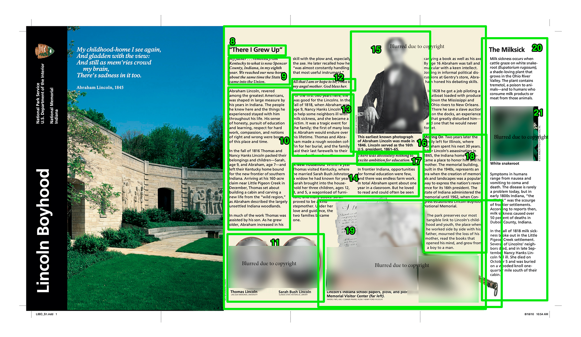
What if the image doesn't have a person? An animal might use the same approach (what's its motivation?). This approach, of course, can become quite complicated by a collage of, say, a National Park ecosystem shared by people, animals, and plant life. In some scenes we have encountered, there are dozens of potential starting points and mini-narratives to tell. The key, in those cases, is to create a strategy for your approach and then carry it all of the way through (such as, I'm going to start by describing all of the things the people do in this place; then, I'm going to describe all of the animals in action; then the plant life, or in some other order, depending on what's most important in that particular place).
A type of flower, though, would not necessarily have a motivating action to attribute (unless you are focusing on describing photosynthesis or seed spreading). Neither would an image of a piece of machinery. So for an artifact or any type of visual protagonist that does not have human or animal motivations, I suggest simply clipping out the Who (agent or actor) part of the approach and focusing instead on the What, When, and Where. What is this thing, and when and where is it at? Such a contextualization process will held to render meaning and to put the artifact into its place. A How and Why also probably exist in this scenario. So those can be teased out as well.
SHARE YOUR DESCRIPTION WIDELY AND CONSIDER ALL FEEDBACK:
But what if there is no person or thing? One of the toughest challenges we have faced as describers is describing a map (check out the paper we wrote about that issue on our Research page). A map, at least theoretically, has no fact that is more important than any other and no clear narrative to tell. It does, though, have a purpose, and we recommend first identifying the purpose of the map. If you can do that, then you can probably develop a strategy to communicate that purpose. For example, maybe the map is shared to show highlights of the area, if you are a tourist, so the description would take a "highlights" approach. Or maybe the map is designed to help a person navigate a complex area, so the description would take a "navigation" approach. Or maybe the map isn't really about highlights or navigation; instead, it really just intends to show people the way it used to be, or how something was done, with no intention of the viewer of the map walking in those footsteps. If that's the case, a cultural-history approach or a natural-history approach might be the best choice.
Once all of that has been settled, the describer still needs to determine what comes first, second, third, etc., since an audible experience is linear while a visual experience is not. But this process should not happen alone, with a single writer dropping the description onto the world and walking away. Like with any type of writing, Audio Description comes to life when it is given to its intended audience. So share your drafts with a trusted circle of advisers who are blind or who have low-vision (a group of even 5 independent reviewers can make a big difference in the quality of the descriptions). Get feedback as you go. Share what you publish widely, and open your communication channels for meaningful feedback. Also, don't just wait for it. Actively seek out feedback, with focus groups, interviews with audiences members, surveys, etc.
Last updated by: Brett Oppegaard, Oct. 1, 2021
The CURRENT UniD DESCRIPTION TEMPLATE (Established in 2021)
As a way to suggest shape for your descriptions, we have created a template for describing that goes in this order, and in this style:
DESCRIBING: [Describe the type of thing you are describing here, i.e. A small, black-and-white photograph]
SYNOPSIS: [~ 1 paragraph overview, 4 to 8 chunks of information; hit the highlights]
IN-DEPTH DESCRIPTION: [The rest of the description, if needed]
CAPTION: [Caption goes here]
CREDIT: [Credit goes here]
RELATED TEXT: [Related text goes here]
COMPONENT NAME:
Start with the type of image, such as MAP: (we found the inclusion of MAP, TEXT, PHOTO, and the like, helps to set the stage for the listener in the Table of Contents view). This label then should include the basic information to tell the listeners what they will get by selecting this description, such as the title of the image being described (if it has one), who made it (if that seems important), and the year it was created (if that seems important), and its physical location at the place (if that's relevant).
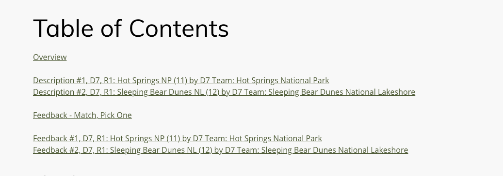
EXAMPLES (from Belmont-Paul Women's Equality National Monument):
- IMAGES: Suffragist efforts
- IMAGES and TEXT: Park access
- IMAGE, QUOTE, and TEXT: Alice Paul and the National Woman's Party
- TEXT: Definition of "suffrage"
- MAP: Area around monument
- CHART and TIMELINE: The path to equal rights
- CHART and QUOTE: Percentage of women in congress
DESCRIBING:
How would you describe the artifact you are describing? In this order: Size (small / medium / large) / Shape (horizontal / vertical / square / cut-out / oval / circle) / Type (i.e., photograph, chart, or map; see hierarchy below), distinctive characteristics (like the primary or only image on the page), and the point of view that the listener has (through what frame is this image being conveyed?) ... note only if in black and white (not if in color)
EXAMPLES (from Desert National Wildlife Refuge):
- DESCRIBING: A small, shield-shaped illustration.
- DESCRIBING: A small, horizontal photograph.
- DESCRIBING: A small, square photograph.
- DESCRIBING: A column of small, square photographs that illustrate elements of the page's text.
- DESCRIBING: Color photograph of a golden eagle in close-up, portrait style.
- DESCRIBING: A medium-sized square map with a column of small, horizontal photographs beneath it.
- DESCRIBING: A large map that spreads across two pages of the brochure.
FOR EACH PIECE OF MEDIA BEING DESCRIBED
Choose the description style you will use:
- UniD Storytelling Style, typically for people-oriented images: Tell the story of the image. Who is doing what (to whom?), in this image, when and where, and how and why? A visual story involves both a complication and a resolution. Can you determine both parts of the story in this image?
- UniD Explanatory Style, typically for object-oriented images (i.e. artifacts, landscapes, maps): What is the primary purpose(s) of showing this image? What is it trying to communicate visually? When is it? Where is it? How does it work? How might someone use this image? Why is it important to be shown in this way?
If the component has just a single type of media being described, here is the template for putting the description together (if more than one type, other examples follow):
COPY AND PASTE THIS TEMPLATE INTO YOUR COMPONENT
DESCRIBING: Describe the image being described (per the examples above)
SYNOPSIS: ~ 1 paragraph of Description goes here; present the highlights of the image, ideally in four chunks of information but not more than eight chunks of information to avoid cognitive overload
IN-DEPTH DESCRIPTION: If needed (not always necessary), the rest of the Description goes here, as a continuation of the Synopsis Description (so not saying the same things over again but starting from the synopsis and building from that structure, as if the listener selected "Hear More"); this can be as long as needed, but it also should be structured with the most important description first, second most second, and so on.
CAPTION: Caption goes here
CREDIT: Credit goes here
RELATED TEXT: Related text goes here
AND, IF ... MULTIPLE MEDIA ITEMS OF THE SAME TYPE
If more than 1 of any of these, then signal with a label, like:
IMAGE 1 of 6 over the first one, IMAGE 2 of 6 over the second one, and so on ...
EXAMPLE (from Ulysses S. Grant National Historic Site):
IMAGE 1 of 3: Ulysses S. Grant
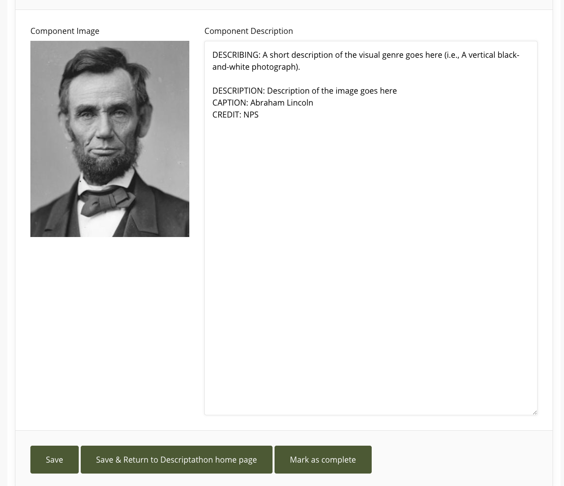
DESCRIBING: A small, oval, black and white photograph.
SYNOPSIS: An 1866 black and white oval photograph of Ulysses S Grant. The 44 year-old Grant is shown in a studio setting, seated with his left arm resting on a table and his left leg crossed over his right. He has dark hair, trimmed above his ears, combed over and parted on his left. He has a neatly trimmed short beard and mustache and a thin-lipped serious expression. His head his turned slightly to his left following his gaze. His right eyebrow is slightly raised. He is wearing a military frock coat with black cuffs, epaulettes denoting his rank as a General. He has on a white shirt with a small bowtie and a dark vest with a watch fob. His right arm lays across his body with his hand resting on his left knee. His open left hand reveals his wedding band on his little finger.
CAPTION: Ulysses S. Grant in 1866, about the time he received the rank of General of the US Army, “conferred by Act of Congress, and the will of the President of the United States.”
CREDIT: Library of Congress
IMAGE 2 of 3: Julia Dent Grant
DESCRIBING: A small, oval, black and white photograph.
SYNOPSIS: An 1864 black and white oval photograph of Julia Dent Grant. The 38 year-old is shown seated on a wooden chair turned to her right at almost a profile position with her hands clasped in her lap. Julia’s dark hair is parted in the middle and pulled tightly back and tied into a bun. She has a prominent nose, her eyes are closed and she is not smiling. She wears a dark colored, closely buttoned dress which is pulled tightly at the waist and flows freely to the floor. She has a white collar and white ruffled blouse sleeves. She has wide cuffs with two white bands surrounding a darker band. There are two designs on each upper arm consisting of those same white bands encircled by darker colored ribbon.
CAPTION: Julia Dent Grant later recalled that this 1864 photograph ”was taken by Brady in New York when I was on my first visit to N.Y. the spring that General Grant first came East.”
CREDIT: Library of Congress
IMAGE 3 of 3: The Grant family
DESCRIBING: A medium, rectangular, black and white photograph.
SYNOPSIS: This black and white photograph of the Grant family was taken around 1866. The portrait shows the family against a washed-out background that appears to be a wall, with decorative panels across the bottom and a broad baseboard. The portrait is stiff and formal and is in contrast to the warm and loving relationship the family actually had evident from their positions in the photograph.
IN-DEPTH DESCRIPTION: The Grants are arranged in a row, with 11-year old Ellen – nicknamed Nellie – standing at the far left. She is attired in an ankle-length, graph-checked dress that appears to be off her shoulders and has a full hoop skirt. The dress is belted at the waist. She wears a pair of what look to be leather shoes with cross straps at her ankles. Her hair is parted in the middle and lays flat against the side of her head. She is wearing a beaded necklace that hangs loosely around her neck. Nellie’s left hand is resting gently on the left shoulder of her father, Ulysses Grant, who is seated to her right. He is wearing a Union officer’s uniform that is open at the front, exposing a white shirt and a bow tie. He has crossed his right leg over the left at the knee. He wears a neatly trimmed beard and mustache and short hair. His left arm is draped around the waist of 8-year old Jesse, the youngest of the Grant children. Jesse’s dark hair is parted on the left side and falls to near his ears. He leans against his father in a relaxed pose. Jessie is wearing what may be a boy’s version of a uniform, with white socks and dark shoes. The shirt has dark lines running down each side and meet at a wide belt. The pants are loose and are closed at the ankles. Jesse stands to the right of his older brother, Fred. Fred is 16 years old and is standing very straight with his right arm bent slightly across his waist, while his left arm is hanging at his side. His hair is parted on his right and is short, reaching just above the ears. He is wearing a military-type uniform, with epaulettes and a wide three-button cuff with dark trim. The jacket is open at the front with buttons on the left, revealing a white shirt underneath. Fred is wearing a pair of straight, loose trousers. To Fred’s left is Julia Grant, Ulysses Grant’s wife. Julia, like Ulysses, is seated. She is dressed in a full-length black dress with hoop skirt. The dress reaches her neck and ends with a small white collar. Her hands are held demurely on her lap. Like Nellie, her hair is parted in the middle and straight on the sides with a bun in the rear. The boy standing on Julia's left is Ulysses S. Grant Jr., about fourteen, more commonly known as Buck. He is also dressed in a military uniform but his jacket is buttoned to the neck. His left arm is bent across his chest and right arm hangs at his side, partially hidden behind his mother. His uniform is almost an exact duplicate of the one worn by Fred. Nellie, Ulysses Grant, and Jesse appear to be looking at the camera, while Fred, Julia, and Buck are gazing to the left.
CAPTION: The Grant family ca. 1866: Ellen “Nellie,” Ulysses, Jesse, Fred, Julia, and Ulysses Jr. “Buck.”
CREDIT: NPS
AND, IF ... MULTIPLE MEDIA ITEMS OF THE DIFFERENT TYPES (THE PRIORITIZED ORDER)
If multiple types of media are gathered together in a package of media, that needs to be kept together to be understood fully, this is the hierarchy we use to stack the descriptions (as UniD style, not based on empirical study):
A. COLLAGE / IMAGE(S) = photo or illustration /
B. MAP /
C. TIMELINE /
D. CHART /
E. QUOTE /
F. TEXT
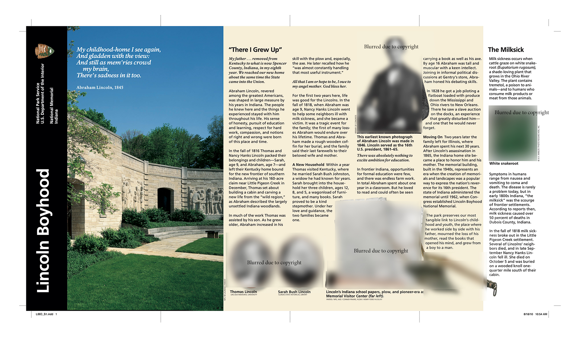
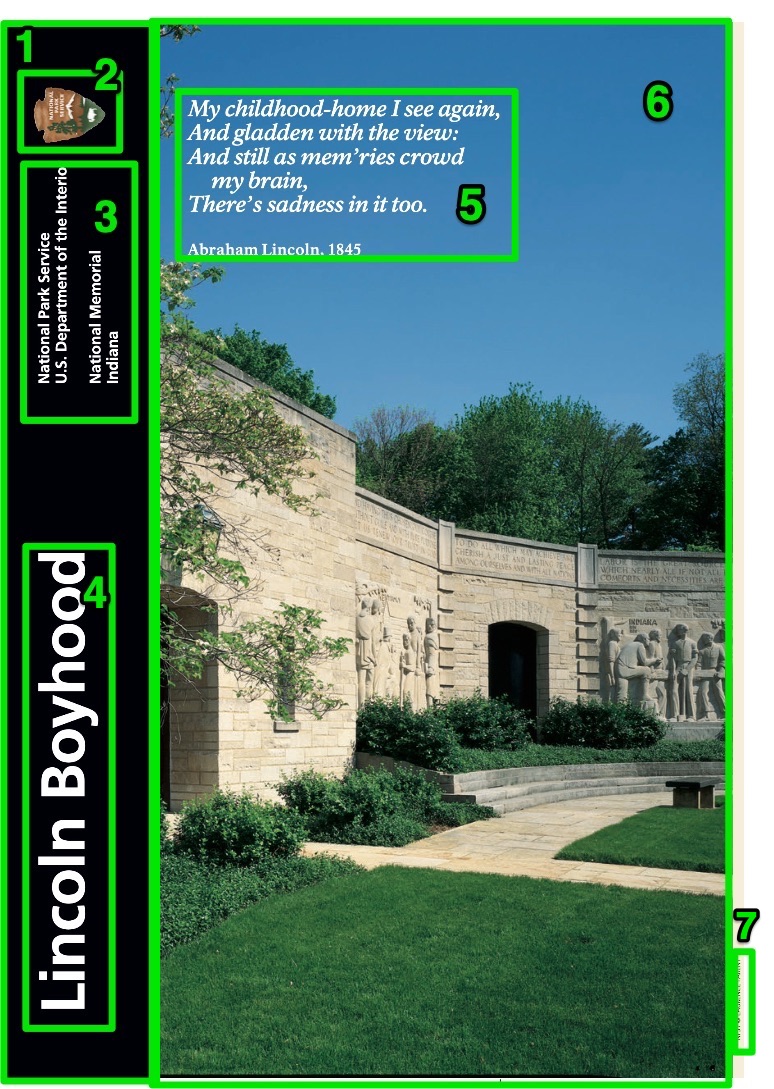
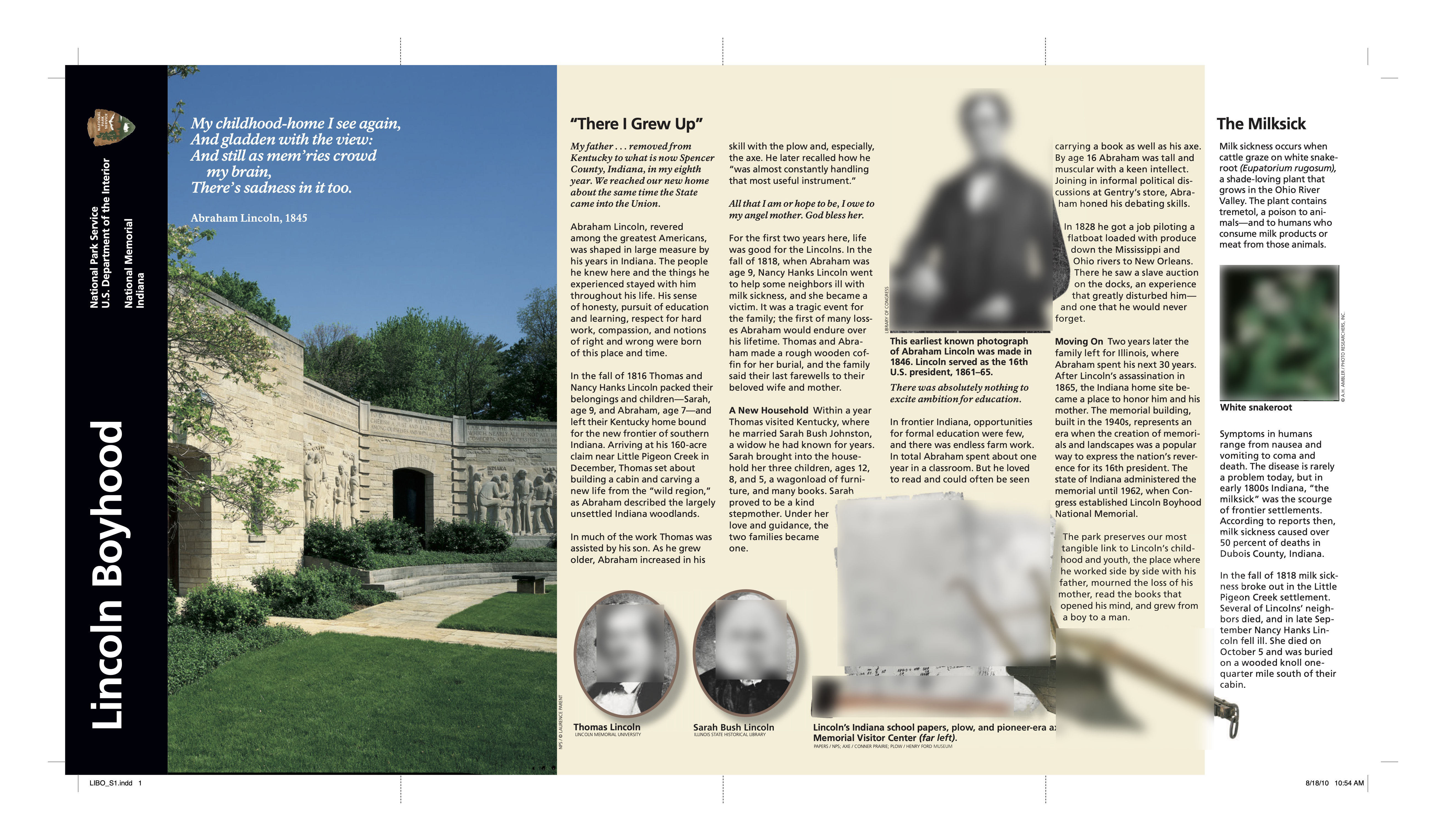
EXAMPLE (from Lincoln Memorial): Image is described first, then the quote is added afterward
IMAGE and QUOTE: Lincoln Memorial
DESCRIBING: A large vertical photograph of the Lincoln Memorial at night covering the entire front side of the brochure, with a quote and a text block overlaying the bottom half of the image.
SYNOPSIS: This full-color photograph shows the Lincoln Memorial at night, as seen from the reflecting pool. The evening sky behind the memorial fades from light fuchsia at the top to deep plum closer to the horizon. Greenish lights can be seen illuminating the black outlines of buildings of the city skyline in the distance. The top quarter of the page is filled mainly by the memorial itself.
IN-DEPTH DESCRIPTION: The memorial is a white rectangular structure, designed to resemble an ancient Greek temple. It is fronted by 12 columns that bulge slightly in the middle before tapering at the top and bottom. These columns support a large marble roof with a smaller rectangular attic perched on top of it. Engravings of eagles with their wings outstretched are connected by a carved garland of leaves, draped across the top edge of this attic. This detail work is visible in the golden glow of spotlights cast upward from the lower roof.
The lower rectangle of the building contains the main chamber of the memorial. The white marble is visible in the golden lights being cast down behind the columns. This divides the memorial into three sections, with the outer thirds strongly illuminated and the center third much darker. The front wall of the memorial opens behind the center four columns, revealing the illuminated statue of President Lincoln seated within. This statue is centered between the middle two columns of the memorial and is lit by the same golden light as the outside of the building.
The monument appears to float in darkness, elevated from the water of the Reflecting Pool, a long rectangular body of water in front of the memorial. Light from the memorial reflects in the pink and orange water that takes up the bottom three-quarters of the photograph and extends from the first fold to the bottom of the image. The surface of the Reflecting Pool is gently ruffled by the wind.
CREDIT: Robert Lautman.
QUOTE: "It is rather for us to be here dedicated to the great task remaining before us—that from these honored dead we take increased devotion to that cause for which they gave the last full measure of devotion—that we here highly resolve that these dead shall not have died in vain—that this nation under God shall have a new birth of freedom—and that government of the people, by the people, for the people shall not perish from the earth." – Abraham Lincoln, Gettysburg Address, November 19, 1863.
NOTE: Remove all document navigation directions in the texts, which are likely to cause confusion when disassociated with the document design.
For example, in the text below, from Charles Young Buffalo Soldiers National Monument, I would remove "(above left)", "(above)" and "(right)."
Original:
RELATED TEXT:
The NAACP honored Young in 1916 (above left). The army was not supportive and kept Young out of World War I. He rode his horse (above) from Ohio to DC to prove his fitness. Instead, he was sent to Camp Grant in Illinois to train troops (right).
Edited:
RELATED TEXT:
The NAACP honored Young in 1916. The army was not supportive and kept Young out of World War I. He rode his horse from Ohio to DC to prove his fitness. Instead, he was sent to Camp Grant in Illinois to train troops.
Last updated by: Brett Oppegaard, Aug. 1, 2021
UniD Best Practice No. 1: Practice Hypermediacy (Medium Orientation)
Every description should begin with some sort of a medium orientation. In other words, descriptions should start with a quick summary of what precisely is being described, in terms of the medium, before the content of that medium is described. Otherwise, the listener likely will have difficulty understanding the description in its context. In academic contexts, such an approach is called "hypermediate." That term just means that the medium is recognized in the communication process as having a form (with affordances and constraints) and given its place in the process. Its opposite academic term is "immediacy," in which the intent of the communication process is to make the medium seem to disappear and not to be involved at all in the encoding, decoding, and interpretation processes.
We primarily work with two-dimensional imagery, including photographs, illustrations, maps, charts, etc., remediating those from visual to audible media. So in those cases, we recommend two specific orientation practices:
1. Give each description a Medium Type Name – When choosing the title for a description, lead that title with the medium type. In UniD projects, we use an all-caps type name, such as MAP: Yosemite Valley Map or IMAGE and TEXT: Abraham Lincoln Portrait. This helps to convey immediately to the listener what sort of a thing is being described before that deeper description happens.
2. Also, describe the Medium Type – At the start of each description, we give a bit of shape to the medium type by describing it. In UniD Style, we use the term DESCRIBING in all-caps, to separate the Type Name from the description. So we might write something like this:
DESCRIBING: A small, square black-and-white photograph
DESCRIPTION: A middle-aged Abraham Lincoln – wearing his iconic stovepipe hat – looks directly at the viewer in this portrait. He is shown from the shoulders up, in a black suit, with a black tie knotted tightly around his neck. His bearded face, with no mustache, indicates that the image was taken either right before his presidency or during it, because he only wore a beard when running for president or serving in that office. And so on. ...
* UniD Best Practices are practices that we have developed in our Descriptathons, and in other research studies, that we feel confident will stand up to empirical research scrutiny (and we are conducting such research on them ourselves). If you are a practitioner, we encourage you to try them and let us know how they worked. If you are a researcher, we encourage you to test them and even try to disprove them.
"Why audio description?
In a society broadly shifting toward visual media, those who are blind or visually impaired are at risk of being excluded from socially and culturally important discourses, including access to primary sources of education and entertainment, such as national parks. This long-term research project addresses that issue by building audio description resources as well as accessible mobile apps for national parks."


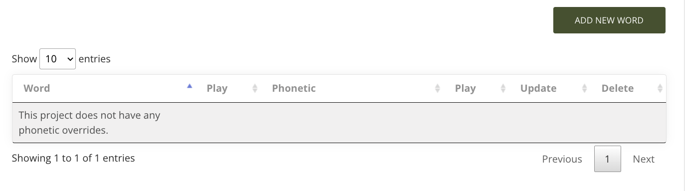
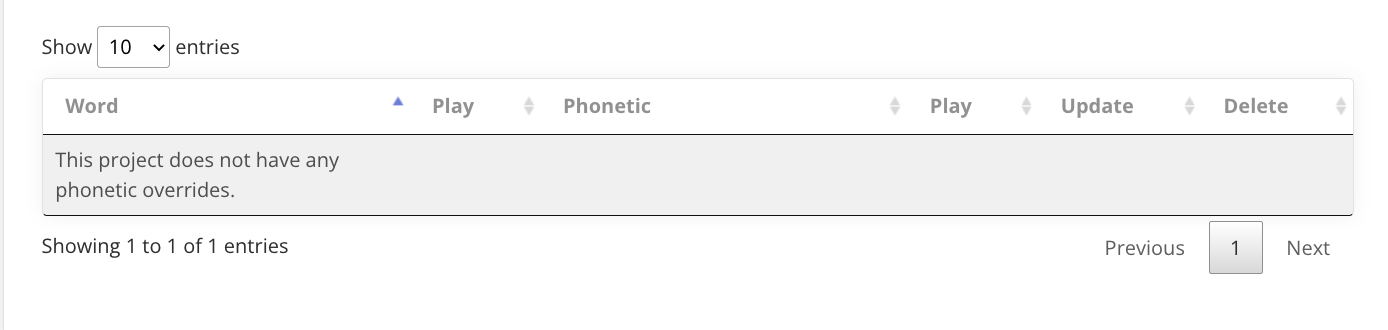
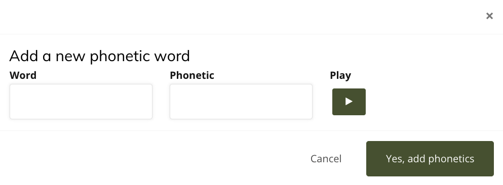 Once you have changed a word, or words, you always can go back and edit and adjust these phonetics through the list of your contributions on the Phonetic Tool home page.